by addacomma | Feb 3, 2020
Animation and motion graphics, Branding, Graphic Design
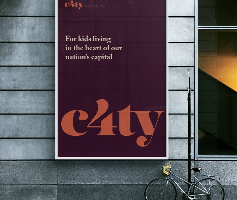
Opening the City to young people
C4TY is a new youth focused, youth run organisation aimed at furthering the support available for young people living and studying within the City of London.
Working in partnership with the City of London, we were challenged to develop a new name and identity for the London Youth Forum. This included the design of brochures and publicity material.
We implemented a series of Brand sprints and discovery sessions, which included the very people this brand is for, from the start.
The young people had some amazing ideas and provided us a great starting point to develop an identity that was accessible to them but still conveyed a sense of leadership and support.
The impact of this approach was to deliver a result the young people felt invested in.
Business Awards Branding
Developing a brand that could be used to connect all the London Boroughs whilst still work independently.
Gloucestershire YST
A brand for a youth support team working with approximately 6,000 vulnerable young people across Gloucestershire.
Power 100
An annual publication highlighting the 100 most influential disabled people in the UK.
Messaging for all
Comprehensive messaging for a large employee owned organisation that provides services in wide range of sectors.
by addacomma | Jan 29, 2020
A message which works for all
A large employee owned organisation which provides services in industries as wide ranging as Early Years education to Justice, working in 40 prisons.
The organisation had grown to provide services to more people from many walks of life but hadn’t refreshed its messaging for some years and needed a simple message that could work for all audiences.
Fun, interactive workshops with a cross section of colleagues at the organisation, helped identify key threads of the messaging. This was then worked up to create new values, a new purpose – rather than vision and mission along with a simple tag line which was versatile and worked for all. Commissioners and customers alike responded positively to it. Colleagues felt it represented the work they do and are proud to use it. From the tagline all the corporate messaging and branding was developed.
Focus groups to cover the UK.
Staff from all levels of the business participated.
Additional online poll/survey responses collated.
“This was a complex project involving multiple stakeholders and events, it required diplomacy and creativity. The team handled all this brilliantly. They took all the feedback then developed messaging which works across the organisation and has stood the test of time.”
Director of Sales and Marketing, Prospects
ActionAid
Copywriting a campaign website focused on women and work for a global charity.
Blackfen Community Library
A redesign for a local community library and hub presented the opportunity for refined user experiences and increased functionality.
DMH Associates
Organising and running a three day virtual conference for more than 400 delegates meant utilising a mix of technology and innovative presentation.
Power 100
An annual publication highlighting the 100 most influential disabled people in the UK.