New Year, new clients

New Year, new clients

New Year, new clients

Not sure how it is already more than one month into 2022 but here we are. Towards the end of last year, I wrote a piece explaining our team had grown in 2021. So, I thought I would take this opportunity to write about the new clients we have been fortunate to work with in 2021.

Our new clients joined our collection of organisations that we produce a range of marketing, communications and design assignments for. We are very fortunate to be able to work on such interesting, diverse and exciting projects. One week we will be producing a new website, the next an animation and the following a range of social media posts. It keeps our creative juices flowing.

We had a number of return clients in 2021, including Shaw Trust and Ambiental Risk. Shaw Trust asked us to help with their annual Power 100 publication and their safeguarding report. Ambiental asked us to produce a new promotional animation for them.

Support goes both ways so as well as the services we always provide for our clients, we try to go above and beyond to add extra value and when we can provide favours. We believe in what our clients are trying to achieve and usually have to rein ourselves in knowing there are only so many hours in a day – so we love it when we get a chance to go overboard for a client and do that bit extra. These are just some of the ways we demonstrate the importance of supporting one another.

We also started working with the Career Innovation Company, helping them with their social media. It has been great to work on engaging potential clients through their channels and driving more visitors to their website. They have some really interesting blogs which have certainly got us thinking.

The Gandhi Foundation tasked us with updating their website – then added in a rebrand and some social media support too. Again, another interesting project which required some research into the life of a fascinating, wise man. You can see some of the work connected to this project on our Behance account.

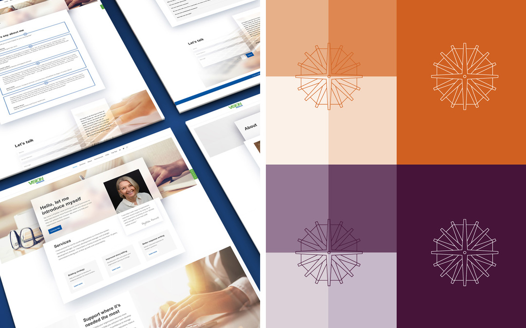
We’ve also been back working with Vision Mission on a new website, another interesting project which concluded the branding and messaging work we did for them in 2020.

2021 was another busy year for We Are Comma and 2022 looks to be the same. No doubt we will be working even more new clients too.

Pic showing the updated Disability Power 100 logo and a spread from the new publication
5 scary design mistakes to avoid

5 scary design mistakes to avoid

5 scary design mistakes to avoid

1. Poor legibility

This means text lines that are too long (use max 60–70 characters), dense blocks of words in small size and blocks with too little leading (the space between). Also, having text aligned centrally, or justified (especially in large amounts) can present problems for readers too. Note that left-aligned text is always easier to read, especially for those with visual impairment or where English is a second language. Equally, any copy should always be displayed using good contrast from the background. It doesn’t necessarily have to be dark on light but careful consideration should always be given when any text is used on a darker background. Note also, the difference between how electronic and physical print delivery displays too. Print generally requires more contrast to show any variation between shades or tints.

2. Too many fonts used or unsuitable combinations of style

Unless carefully handled, too many fonts can mean that the design has a disorganised, unprofessional look. A decent rule of thumb is to stick to two. Remember, certain fonts might have additional weights (or thicknesses) and these can be used to help add variety without the same consequence.  All too often, lazy stereotypical font choices are applied to designs, with the same display font used again and again. This reduces the impact and can, in some instances also make it harder to read. On other occasions, it’s simply that personal choice has overruled common sense. For example, a loose, light handwritten style would most likely not be the first choice for a serious financial institution.

3. Ignoring or failing to incorporate any visual hierarchy rules

Hierarchy is a key graphic design principle. It communicates with the viewer the importance of each element to those around it. Think carefully about the order that any titles, subtitles, blocks of text need to be read. Is the correct message presented? The size, weight and colour all play their part, as does the space allowed around any elements.

4. The placing of any elements within the design

With proper alignment (and this doesn’t necessarily mean total symmetry), an order or balance can be created that helps to hold a design together. If this is missing, products or material can look messy, disorganised and as we’ve mentioned before unprofessional. There will always be examples that appear to break the rules but these are usually produced by skilled practitioners and normally there’s still a (hidden) system at work. By using an underlying grid, quality control can be maintained whilst still allowing scope for creativity. Think about magazines and newspapers. These need to be produced to strict deadlines yet still manage to include layout variety.

5. Failing to communicate effectively

Even trained designers can be guilty of this. It’s easy to get caught up and create a design that loses sight of the audience that it’s intended for. Making it appeal to our tastes or preferences rather than focusing on how the item needs to be used is a mistake. Additionally, this can also lead to any criticism of the design, being taken personally rather than objectively. A decent rule of thumb is to keep things simple.


Photo by Kaboompics.com from Pexels

15 + 14 =