by addacomma | May 5, 2021
Branding, Messaging, PR & Comms
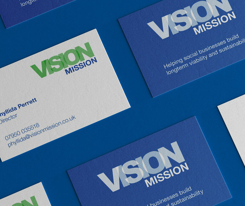
Bringing a vision to life
An organisation, which provides strategic and business development support to help social businesses thrive, wanted to create fresh branding and messaging to reach more people.
The organisation wanted a new brand and messaging to underpin it, to reach more people and create an impactful impression.
We Are Comma ran a full day workshops to draw out the organisation’s purpose, vision, mission and values. In addition, branding workshops developed ideas for the look and feel of the organisation’s brand. Running these workshops together ensured that the messaging and branding work hand in hand. The branding and messaging have now been rolled out and given the organisation a professional image.
“I’m delighted with what We Are Comma have created. The messaging perfectly encapsulates what we want to share about the strategic services we provide for the social enterprises, charities and organisations we work with. The brand is fresh and speaks a thousand words to demonstrate what we stand for as an organisation. I’m really pleased with the business cards and other printing which We Are Comma have created. I’m looking forward to creating a website with the team in future.”
Director, Vision Mission
Business Awards Branding
Developing a brand that could be used to connect all the London Boroughs whilst still work independently.
Messaging for all
Comprehensive messaging for a large employee owned organisation that provides services in wide range of sectors.
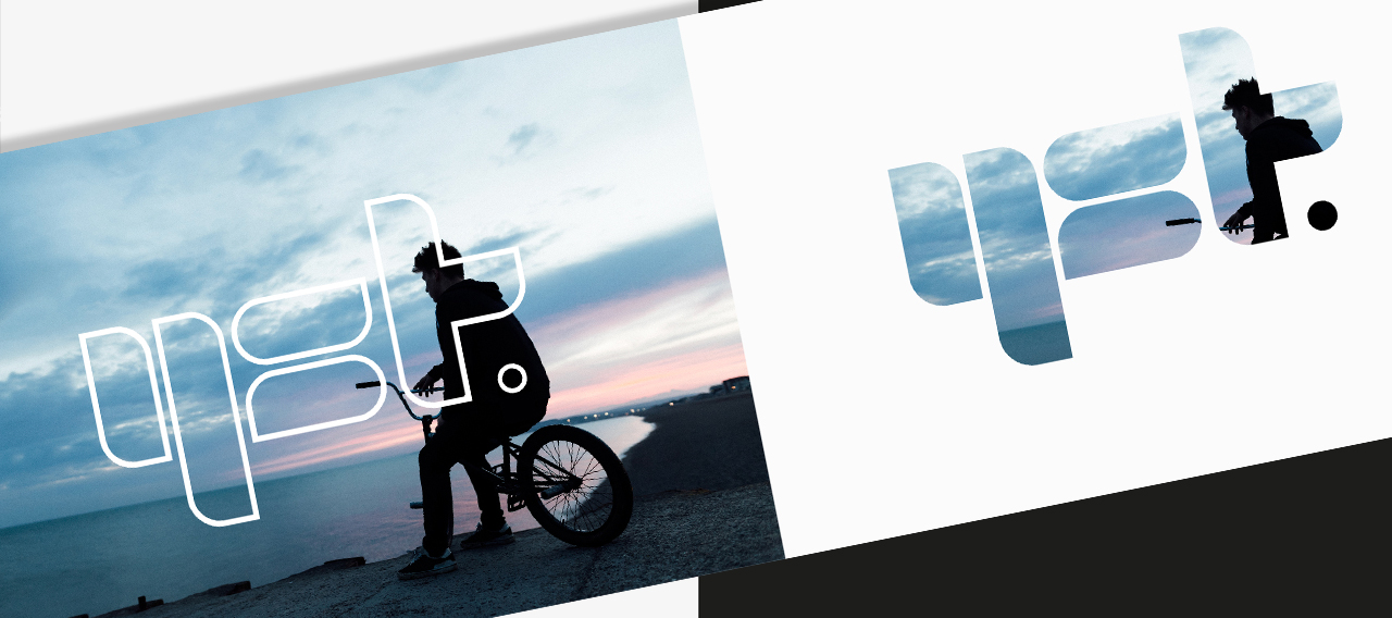
Gloucestershire YST
A brand for a youth support team working with approximately 6,000 vulnerable young people across Gloucestershire.
C4ty
A brand for an organisation providing support to young people living and studying within the City of London.

by addacomma | Jan 27, 2020
Animation and motion graphics, Branding, Graphic Design
Creative to engage young people
The Gloucestershire Youth Support Team (YST) works with approximately 6,000 vulnerable young people across the county, more than 90% of whom say it has made a difference to their lives. The YST is run by Prospects on behalf of Gloucestershire County Council, in a partnership
YST tasked us with creating a new brand identity to be relevant to the young people they work with and yet professional.
The design team created bold shapes that allowed for either block contrast colour overlay or for a window through to an image.
Specific patterns (and colours) were developed to identify (and differentiate) the various strands of service but applied in such a way to still allow for general recognition of the Gloucestershire YST brand.
The brand has been applied to signage, office design, wall graphics and colour schemes too. Consideration given to assist team/department identification especially within office space (collectively shared or otherwise).
“The brand developed by the team is flexible and appealing to the young people we work with, as the team worked with service users to design and develop it. In addition, the team created a more ‘corporate or partnership’ version for us, which enables us to target our messaging appropriately for our different audiences. Our brand is well recognised. I would recommend the designers.”
Director of Children and Young People’s services, Prospects
Business Awards Branding
Developing a brand that could be used to connect all the London Boroughs whilst still work independently.
Blackfen Community Library
A redesign for a local community library and hub presented the opportunity for refined user experiences and increased functionality.
C4ty Branding
A brand for an organisation providing support to young people living and studying within the City of London.
Scadbury Park
A film highlighting the work of a charity which tackles intergenerational loneliness.