by addacomma | May 5, 2021
Branding, Messaging, PR & Comms
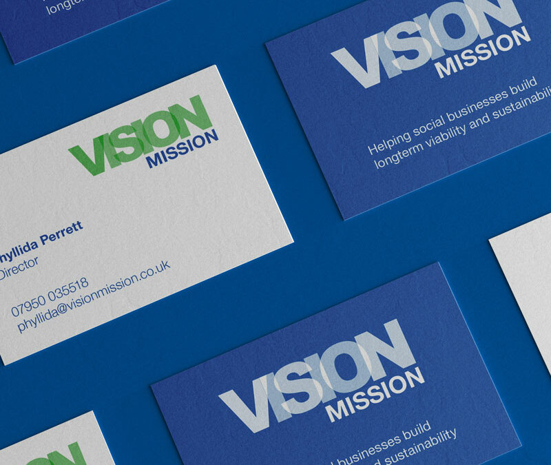
Bringing a vision to life
An organisation, which provides strategic and business development support to help social businesses thrive, wanted to create fresh branding and messaging to reach more people.
The organisation wanted a new brand and messaging to underpin it, to reach more people and create an impactful impression.
We Are Comma ran a full day workshops to draw out the organisation’s purpose, vision, mission and values. In addition, branding workshops developed ideas for the look and feel of the organisation’s brand. Running these workshops together ensured that the messaging and branding work hand in hand. The branding and messaging have now been rolled out and given the organisation a professional image.
“I’m delighted with what We Are Comma have created. The messaging perfectly encapsulates what we want to share about the strategic services we provide for the social enterprises, charities and organisations we work with. The brand is fresh and speaks a thousand words to demonstrate what we stand for as an organisation. I’m really pleased with the business cards and other printing which We Are Comma have created. I’m looking forward to creating a website with the team in future.”
Director, Vision Mission
Business Awards Branding
Developing a brand that could be used to connect all the London Boroughs whilst still work independently.
Messaging for all
Comprehensive messaging for a large employee owned organisation that provides services in wide range of sectors.
Gloucestershire YST
A brand for a youth support team working with approximately 6,000 vulnerable young people across Gloucestershire.
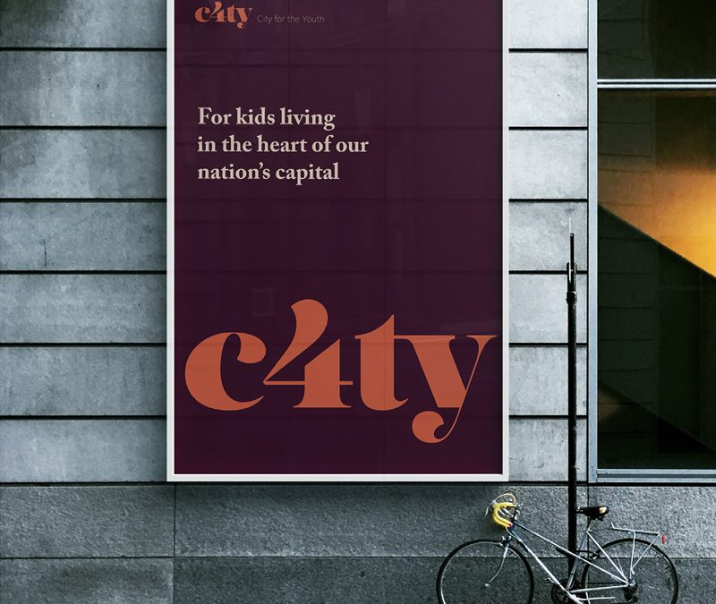
C4ty
A brand for an organisation providing support to young people living and studying within the City of London.
by addacomma | Feb 3, 2020
Animation and motion graphics, Branding, Graphic Design
Opening the City to young people
C4TY is a new youth focused, youth run organisation aimed at furthering the support available for young people living and studying within the City of London.
Working in partnership with the City of London, we were challenged to develop a new name and identity for the London Youth Forum. This included the design of brochures and publicity material.
We implemented a series of Brand sprints and discovery sessions, which included the very people this brand is for, from the start.
The young people had some amazing ideas and provided us a great starting point to develop an identity that was accessible to them but still conveyed a sense of leadership and support.
The impact of this approach was to deliver a result the young people felt invested in.
Business Awards Branding
Developing a brand that could be used to connect all the London Boroughs whilst still work independently.
Gloucestershire YST
A brand for a youth support team working with approximately 6,000 vulnerable young people across Gloucestershire.
Power 100
An annual publication highlighting the 100 most influential disabled people in the UK.
Messaging for all
Comprehensive messaging for a large employee owned organisation that provides services in wide range of sectors.
by addacomma | Jan 30, 2020
Data Segmentation, Email Marketing, Lead Management, SEO
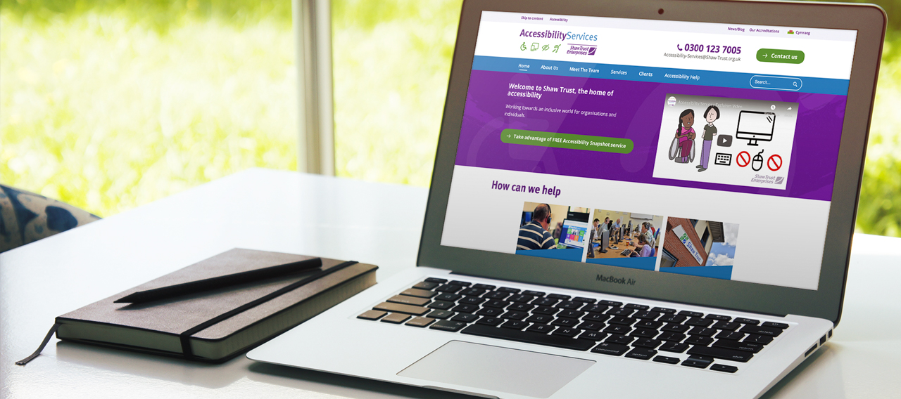
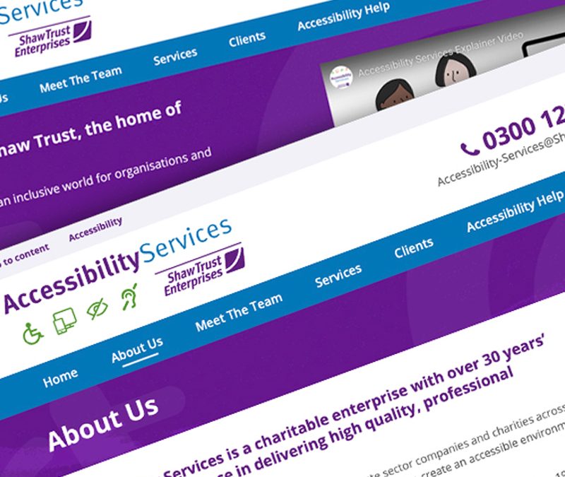
Helping Accessibility Services increase its bottom line
Accessibility Services is company that helps organisation websites and media be accessible to all and with more than 30 years’ experience, working with central and local government, private sector and charities across the UK and internationally.
Help the business unit to go from breaking even to profitable.
A dramatic improvement in revenue through customer segmentation, sales training, lead management, email marketing, utilising strategy relationships with local authorities and other partners, maximising the ‘call to actions’ in all communications.
The team set up a simple customer relationship management system, for Accessibility Services, to ensure the sales process is managed easily by multiple team members. This transformed Accessibility Services from an organisation which broke even financially to a profitable business within one year.
The other major win was having a separate strategy for existing clients to make sure they are communicated with regularly to maximise revenue. The strategy utilises email marketing and an effective account management process.
Email campaigns delivered.
Contacts segmented and organised.
“Mark goes the extra mile to understand business needs so that an effective marketing approach can be implemented, to obtain the commercial results required. He is willing to share his knowledge and expertise in order to up-skill those he works with, thereby leaving a lasting legacy. Mark’s passion and enthusiasm is infectious creating a positive working environment for all those he engages with. It has been a pleasure working together.”
Operations Manager, Accessibility Services
Messaging for all
Comprehensive messaging for a large employee owned organisation that provides services in wide range of sectors.
Cube Direct
Thorough research and testing were required to set up a CRM system that automated tasks to reduce time spent on data entry.
DMH Associates
Organising and running a three day virtual conference for more than 400 delegates meant utilising a mix of technology and innovative presentation.
Blackfen Community Library
A redesign for a local community library and hub presented the opportunity for refined user experiences and increased functionality.
by addacomma | Jan 27, 2020
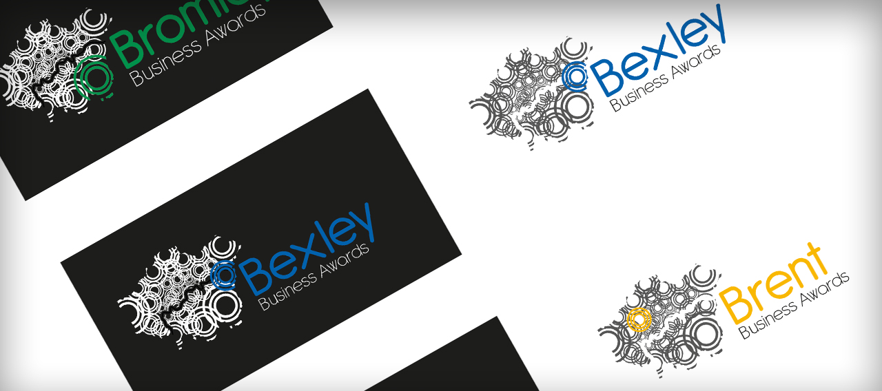
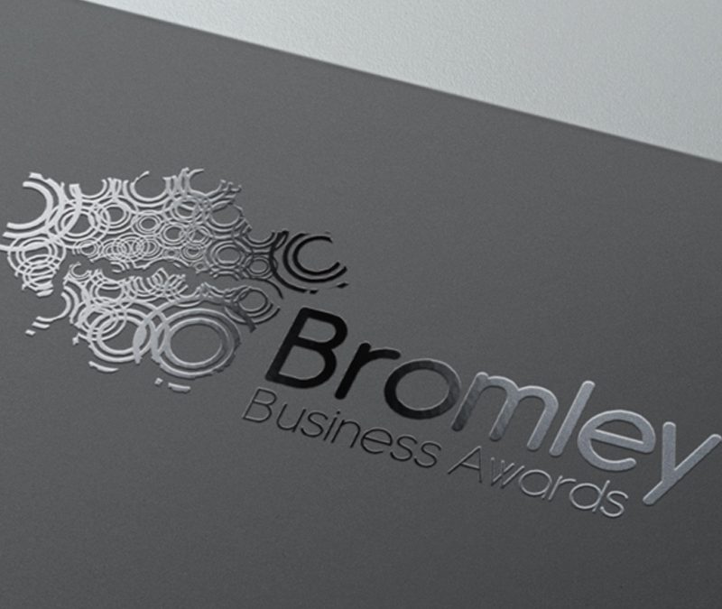
Creating an awards brand which means business
Business awards run across London in Bromley, Bexley and beyond.
The employee owned organisation which ran a number of Business Awards in London challenged our team to create a new brand which could be used across all areas it operates in.
The brand identity we created means better collective brand recognition wherever the location of the awards. The concept followed the theme of ripples spreading from the source, the borough the awards are taking place in, hinting at potential spheres of influence and interaction across the surrounding areas. Colour would be informed in the first instance by existing borough brand colours. The multitude of colours could then be brought together when representing the overall London Business Awards to accentuate the capital’s rich diversity of people and businesses.
Our team also managed the communications around the awards from opening nominations to the award ceremony and announcing the winners to the world.
The London Business Awards entered by 193 businesses from across the capital. 103 finalists and 11 categories winners plus one overall winner.
Businesses that entered award categories.
Made the final shortlist.
Category winners
(plus one overall business winner).
“The team rose to the challenge and delivered a solution that offered flexibility and went some way to represent the interconnected nature and diversity of business in London.”
Director of Sales and Marketing, Prospects
Power 100
An annual publication highlighting the 100 most influential disabled people in the UK.
Gloucestershire YST
A brand for a youth support team working with approximately 6,000 vulnerable young people across Gloucestershire.
C4ty Branding
A brand for an organisation providing support to young people living and studying within the City of London.
Messaging for all
Comprehensive messaging for a large employee owned organisation that provides services in wide range of sectors.