by addacomma | Jul 22, 2021
video & photography, motion graphics, video editing
Clear and practical support for the experts
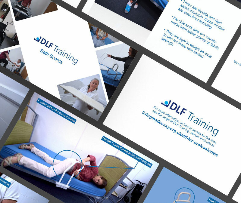
Three days of filming produced more than 40 training videos for a national charity that looks to add life to years with practical advice.
The DLF is the UK’s leading national charity helping older and disabled people live independently at home with equipment. The organisation provides information and training for health care professionals, ensuring that the best person-centered care is delivered. The DLF also supplies the wider public. Helping people make better informed assistive technology choices.
For this project, the DLF required a range of products and aids to be filmed in operation so the final films could be used during face-to-face training sessions or as an online resource.
Filming lasted three days and took place at a DLF training facility, with more than 40 items filmed.
The footage then had graphics and animated content added during editing. With titles and call to action referencing the organisation’s brand guidelines also added.
“We had a very short time with a venue and staff and many complications owing to Covid-19 restrictions but needed to record as much content as possible. Thankfully Al knew exactly what to do and guided us through the three days to get the most out of the time. When seeing the finished product I was amazed at how Al had captured exactly what we needed with limited time, hardly any guidance from us, and completed first time without the need for edits. He really listened to the brief and delivered over and above what was expected. I would highly recommend and would use we are comma in the future.”
Professional Services Manager , DLF
Scadbury Park
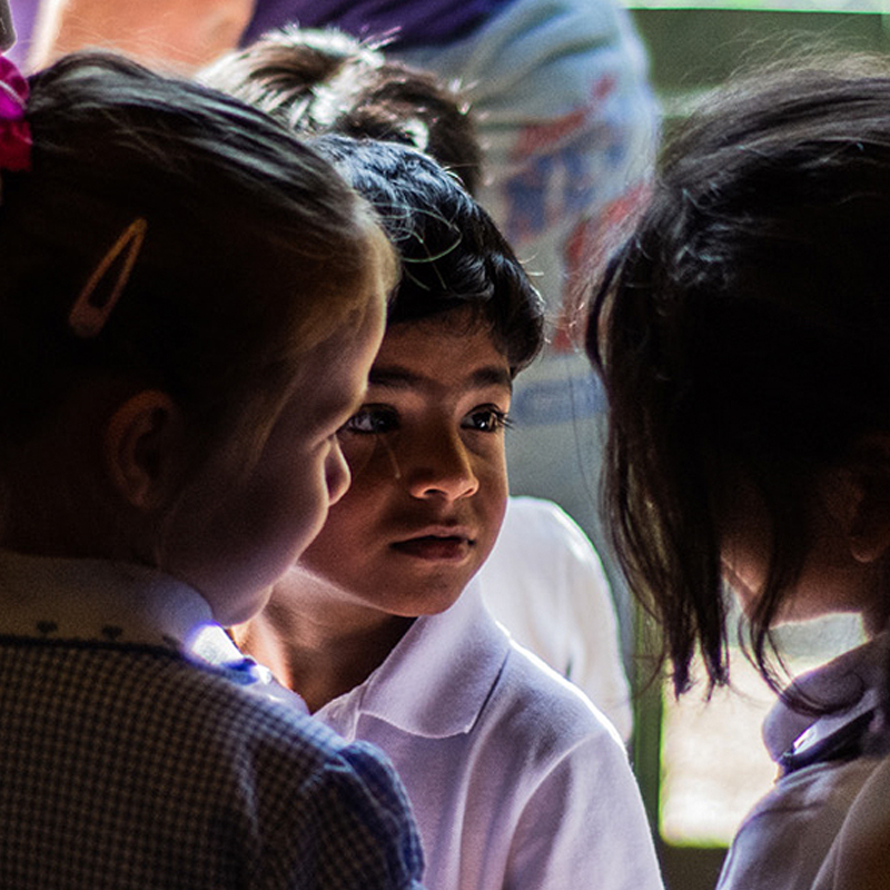
A film highlighting the work of a charity which tackles intergenerational loneliness.
Ambiental Risk Analytics
A commission for a Christmas Ecard led to the adoption of an organisational device screensaver design.
Green Light for Video
Green screen filming and editing delivered a series of online coaching films for an innovative career development organisation.
Power 100
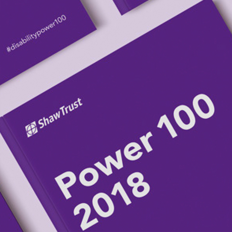
An annual publication highlighting the 100 most influential disabled people in the UK.

by addacomma | Feb 3, 2020
Animation and motion graphics, Branding, Graphic Design
Opening the City to young people
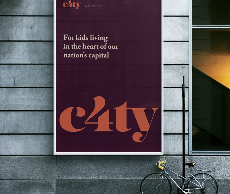
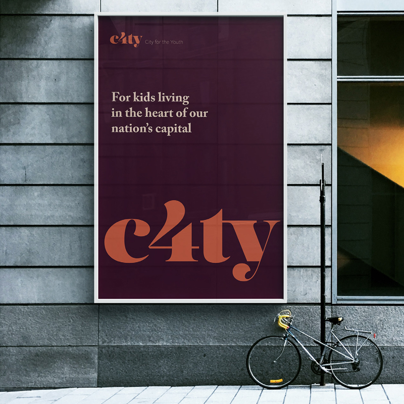
C4TY is a new youth focused, youth run organisation aimed at furthering the support available for young people living and studying within the City of London.
Working in partnership with the City of London, we were challenged to develop a new name and identity for the London Youth Forum. This included the design of brochures and publicity material.
We implemented a series of Brand sprints and discovery sessions, which included the very people this brand is for, from the start.
The young people had some amazing ideas and provided us a great starting point to develop an identity that was accessible to them but still conveyed a sense of leadership and support.
The impact of this approach was to deliver a result the young people felt invested in.
Business Awards Branding
Developing a brand that could be used to connect all the London Boroughs whilst still work independently.
Gloucestershire YST
A brand for a youth support team working with approximately 6,000 vulnerable young people across Gloucestershire.
Power 100
An annual publication highlighting the 100 most influential disabled people in the UK.
Messaging for all
Comprehensive messaging for a large employee owned organisation that provides services in wide range of sectors.

by addacomma | Jan 27, 2020
Animation and motion graphics, Branding, Graphic Design
Creative to engage young people
The Gloucestershire Youth Support Team (YST) works with approximately 6,000 vulnerable young people across the county, more than 90% of whom say it has made a difference to their lives. The YST is run by Prospects on behalf of Gloucestershire County Council, in a partnership
YST tasked us with creating a new brand identity to be relevant to the young people they work with and yet professional.
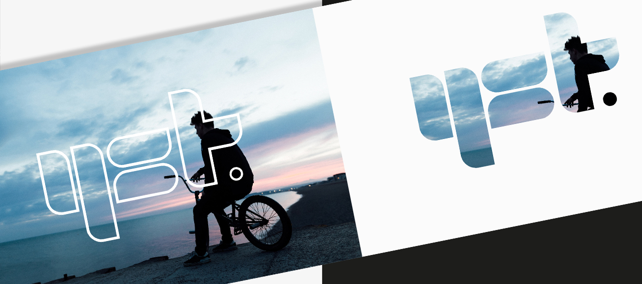
The design team created bold shapes that allowed for either block contrast colour overlay or for a window through to an image.
Specific patterns (and colours) were developed to identify (and differentiate) the various strands of service but applied in such a way to still allow for general recognition of the Gloucestershire YST brand.
The brand has been applied to signage, office design, wall graphics and colour schemes too. Consideration given to assist team/department identification especially within office space (collectively shared or otherwise).
“The brand developed by the team is flexible and appealing to the young people we work with, as the team worked with service users to design and develop it. In addition, the team created a more ‘corporate or partnership’ version for us, which enables us to target our messaging appropriately for our different audiences. Our brand is well recognised. I would recommend the designers.”
Director of Children and Young People’s services, Prospects
Business Awards Branding
Developing a brand that could be used to connect all the London Boroughs whilst still work independently.
Blackfen Community Library
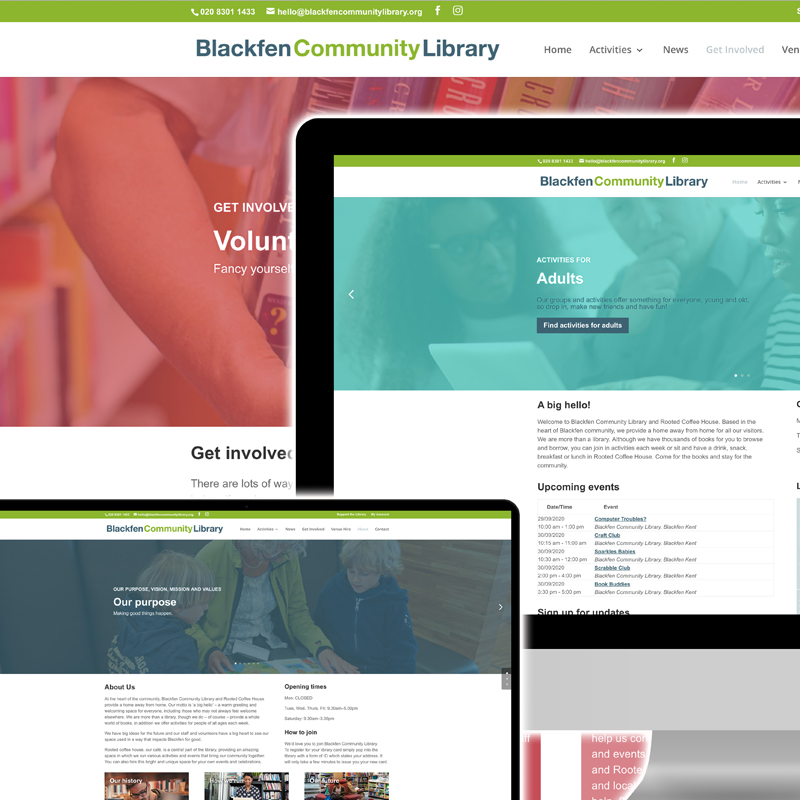
A redesign for a local community library and hub presented the opportunity for refined user experiences and increased functionality.
C4ty Branding
A brand for an organisation providing support to young people living and studying within the City of London.
Scadbury Park
A film highlighting the work of a charity which tackles intergenerational loneliness.
